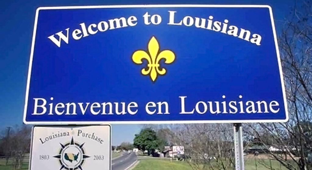
4 Alternatives to Bilingual and Multilingual Signs in Civic Wayfinding

It is estimated that by the year 2020, more than 100 million foreigners will travel to the United States annually – and 65% of those visitors will not speak English. Accommodating these visitors can be very costly, especially when implementing wayfinding and placemaking systems.
No wonder bilingual signs and multilingual signs are so important today. Here are a few considerations for creating environmental and experiential graphic systems that accommodate visitors who don’t speak English.
1. Icons: A Picture is Worth a Thousand Words.
Using symbols can overcome many obstacles in wayfinding and placemaking systems even for English speakers. But an additional major benefit to symbol use is overcoming the language barrier without implement bilingual or multilingual signage.
Universally recognized icons like directional arrows or transportation modalities such as bikes, cars, trains, and airplanes can all work to direct people with Limited English Proficiency (LEP) regardless of their primary language.
2. Visual Maps: Follow the Path to Success.
Maps are a simple and effective way to direct non-English speaking patrons to certain locations. Pictures of landmarks paired with color-coded directional lines and arrows work to denote the route to important destinations in your city. This is especially critical for supporting international tourism.
3. Interactive Touch Screens: Let Your Fingers Do the Walking.
Interactive touch screens can overcome many language barriers because these digital wayfinding devices can be easily programmed to support multilingual text at very little cost.
Although interactive touch screen technology is still new to most cities, this experience design approach is a powerful tool for accommodating non-English speaking visitors.
4. Print Materials: Don’t Forget the Supporting Material.
If you plan on installing multilingual signage, any supportive material to the system also needs to be provided in additional languages. Printed guides and maps, city newsletters, and other promotional materials should work to compliment your multilingual signs.
A visitor’s experience with your city doesn’t end when they arrive. Your wayfinding and placemaking system – from maps and icons to multilingual signs to interactive touch screens – is a critical facilitator for your visitor’s experience.